


The W3C defines CSS as "a simple mechanism for adding style to web documents".
The definition implies that an HTML document is supposed to handle structure
and content, which compose the semantics of the document. However, in the last
couple of years we’ve seen the rise of some very popular frameworks that make
faster responsive web development. It’s no surprise to see HTML documents with
tags like <div class="row"><div class="col-md-12">...</div></div>. I
mentioned before that CSS was the mechanism to add style. HTML, in turn, was
supposed to handle the structure and content. Can you spot what’s going on
with the HTML structure? The structure is tightly coupled with the visual
presentation of the content and this is not practical in the long term.
Maintaining this codebase will be hard and expensive.
Enter BEM
Think of how many times you have used these CSS classes to make your HTML
documents more appealing or simply as eye-candy. Isn’t HTML supposed to
represent the meaning of the structure of the content you have on it? Does
col-md-12 have semantic importance in your document? The answer is probably
no. This is where BEM becomes handy. If you haven’t heard or read about BEM
before, the BEM methodology is a naming
convention for classes in HTML and CSS documents. It was created by Yandex and
they state in their methodology website that:
it was invented to develop sites which should be launched fast and supported for a long time. It helps to create extendable and reusable interface components.
BEM certainly fulfills that role. There are a couple more methodologies around like SMACSS or OOCSS, but I’ve found BEM to be the most approachable and less cumbersome. The concept is easy to digest and, together with a CSS preprocessor, maintaining CSS and HTML is as easy as it can be.
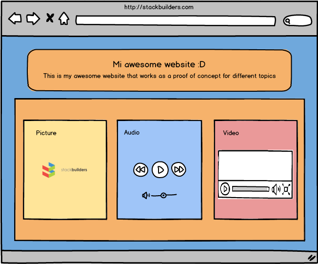
Normally, if we use some responsive framework like Bootstrap we would have something like this:
<body>
  <div class="row">
    <div class="col-md-12 header">
      <h1>Mi awesome website</h1>
      <p class="header-explanation">This is my….</p>
    </div>
  </div>
  <div class="row">
    <div class="col-md-4 content-item picture">…</div>
    <div class="col-md-4 content-item audio>">…</div>
    <div class="col-md-4 content-item video">…</div>
  </div>
</body>
What would happen if you just try to figure out what each col-md-4 is for?
What if you have more tags with the audio or video class in other pages and
you modify them? In a large code base, could you modify it without fearing the
changes of other pages that you may not be aware are also using those classes?
This is where BEM enters and allows us to rewrite the HTML in something similar
like this:
<body>
  <div class="header">
    <h1 class="header__title">...</h1>
    <p class="header__description">...</p>
  </div>
  <div class="content">
    <div class="content__item content__item--picture">…</div>
    <div class="content__item content__item--audio">…</div>
    <div class="content__item content__item--video">…</div>
  </div>
</body>
If we read the HTML, we now have classes like content__item--video. The
structure we have together with the new naming convention for the classes are
descriptive about the tags inside the document, what they contain and how they
work with the rest of the document, conveying in the semantics of what we want
to represent with the HTML. Now, we can confidently change those elements with
the class content__item--video. But wait, did I just lose the classes from
Bootstrap like col-md-4? It's true, you are not going to have a proper grid
layout and other styles the CSS frameworks provide. But, NO WORRIES if you
are using a preprocessor as most of the large projects do. Just keep reading.
Adding SASS and LESS
CSS preprocessors come in handy when using BEM. Nowadays, any major framework has some tool to preprocess CSS. Languages like SASS or LESS are very common. These languages empower the BEM methodology so that we can keep more organized CSS code which can then be divided in several modules. Furthermore, preprocessors allow us to use variables, functions or mixins. Although BEM suggests a file structure, it is not mandatory and we can use our own as long as it follows BEM principles.
Using SCSS we could have something like this in our main.scss file:
@import "bootstrap";
@import "lib/variables";
@import "lib/mixins";
@import "base/*";
@import "components/*";
Consider that according to the project size and needs, the file structure could
have deeper nesting or be more specialized. Furthermore, Bootstrap includes
mixins for the grid
and other Bootstrap
components.
Additionally, imports like @import 'base/*' can be achieved via third party
libraries like sass-globbing,
since we use BEM, loading order usually doesn't matter with files in the same
hierarchy. So, for the sake of this example we could have something like this
in our file: components/homepage.scss
.header {
  @include make-row;
  … &__title {
    ...;
  }
  &__description {
    ...;
  }
}

.content {
  @include make-row;
  &__item {
    @include make-md-column(4);
    &--yellow {
      background-color: yellow;
    }
    &--blue {
      background-color: blue;
    }
    &--red {
      background-color: red;
    }
  }
}
Now, you can really see that the HTML is used to define the structure and the
content it has. Meanwhile, CSS is only used to express the visual details of
the document. Moreover, starting from SASS 3.3 we can use something like
&__element to avoid writing the long names. The naming convention can be
really long to write and even cumbersome at first. In fact, following very
strictly BEM conventions, in some situations we could end up with very
long classes and selectors names. Moreover, those situations might even make
the views harder to be visually parsed by the person who maintains it.
Luckily, the very nested documents, where really long names would be an issue,
usually can be splitted into smaller views (large projects usually use view
engines that allow splitting views). Similarly, we should be very careful when
identifying independent units since this will really help when dealing with
long names and doesn't require a views engine. Ultimately, once you see how
easy and specific BEM can be or how it leverages your work, you’ll be more
than happy to use it.
Our experience with BEM
Recently, we worked on a website redesign. Since it was a total redesign, we were not dealing with legacy CSS so we saw the chance to use BEM. The project was built with Ruby On Rails and used the Bootstrap gem. Unfortunately, we were still tied to Bootstrap 2 (the current version is 3 and version 4 is still in alpha release ) since part of the website was not going to be redesigned yet and it would still use Bootstrap 2. We had to keep the gem version and, by doing so, we were restrained to the old Bootstrap version. We would eventually migrate to Bootstrap 3, but we still had to maintain the parts with the old design and those with the new design.
Using BEM, our views or HTML files were only responsible for the structure and
content giving semantics to each view. The views had nothing to do with the
responsive framework choice. On the other hand CSS files describe the visual
style by extending some framework classes or by including some mixins.
Since we rewrote all of the code for the CSS in the new design, the project was
properly organized and we knew exactly which files would affect which parts of
the application style. General styles were placed inside a base directory
which would have files overriding standard HTML elements. Now, you could say
that the purpose of selectors is to be able to apply style to several elements
instead of very specific selectors like those in BEM. We could still achieve
that purpose and a great reuse of the code by combining styles from the
framework and mixins that would be required in several styles.
During the website redesign we went through a couple changes in requirements of
the new design. It’s always expected to have changes with requirements in the
project and it’s part of the premises that agile methodologies consider. During
our development, at first we decided to use the Bootstrap 2 classes and
styles. The functionality it provided was limited compared to the current
version. We eventually outgrew Bootstrap 2 and faced challenges implementing
smooth interfaces. This led us to replace the grid classes from bootstrap
with flex boxes components (there’s even a framework based on using flex
boxes for the grid). The transition was smooth
and no HTML was modified in the process. The CSS files were easily changed as
many reusable components were in mixins which translated in a single change
affecting several styles. Making changes to styles or the view was a breeze.
Unfortunately, the project had to support IE11 as many of the users were still
using it. Some of the cases where we used flexbox were not fully supported by
IE11 and iPhone browsers.
Finally, we ended up migrating to Bootstrap 3. Once again, no HTMLs were modified as the changes didn’t involve any structure, content or the semantics of the views. The whole process took a really short amount of time.
Conclusions
BEM was a key tool to keep maintainable styles in a large project. But, BEM by
itself can really take advantage of using other tools and languages. Languages
like SASS or LESS allow much more complex features and file structure that CSS
doesn’t include by default. Using these tools together gave us a maintainable
CSS where we could confidently make changes to the visuals of the application. The
changes we’d made to styles, from then on, would affect exactly what we intend
to (No more !important inside CSS). The HTML files containing the views were
descriptive about the structure and content they contained. Finally, we had a
CSS codebase that We’d love to maintain during several years inside a large
project.